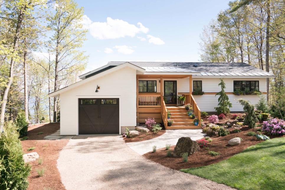
Curb appeal is how a property presents itself from the street. As potential buyers pull up to a home, its the exterior features that make the first impression. Whether someone drives by a home, or sees the first exterior photo online, a property’s curb appeal can make a great impact and potentially peak interest.
The features impacting a home’s curb appeal can include:
- Front door
- Roof
- Landscaping
- Exterior paint/ siding
- Lighting
- Driveway/ walkways
Before-and-After Curb Appeal Makeovers
Source: hgtv.ca
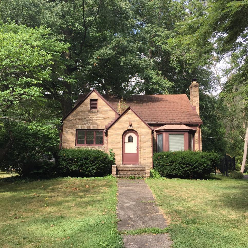
Before: Dark and Drab
Though certainly charming, this cottage’s monotone brown shade isn’t eye-catching and is doing nothing to highlight the home’s architectural good bones.
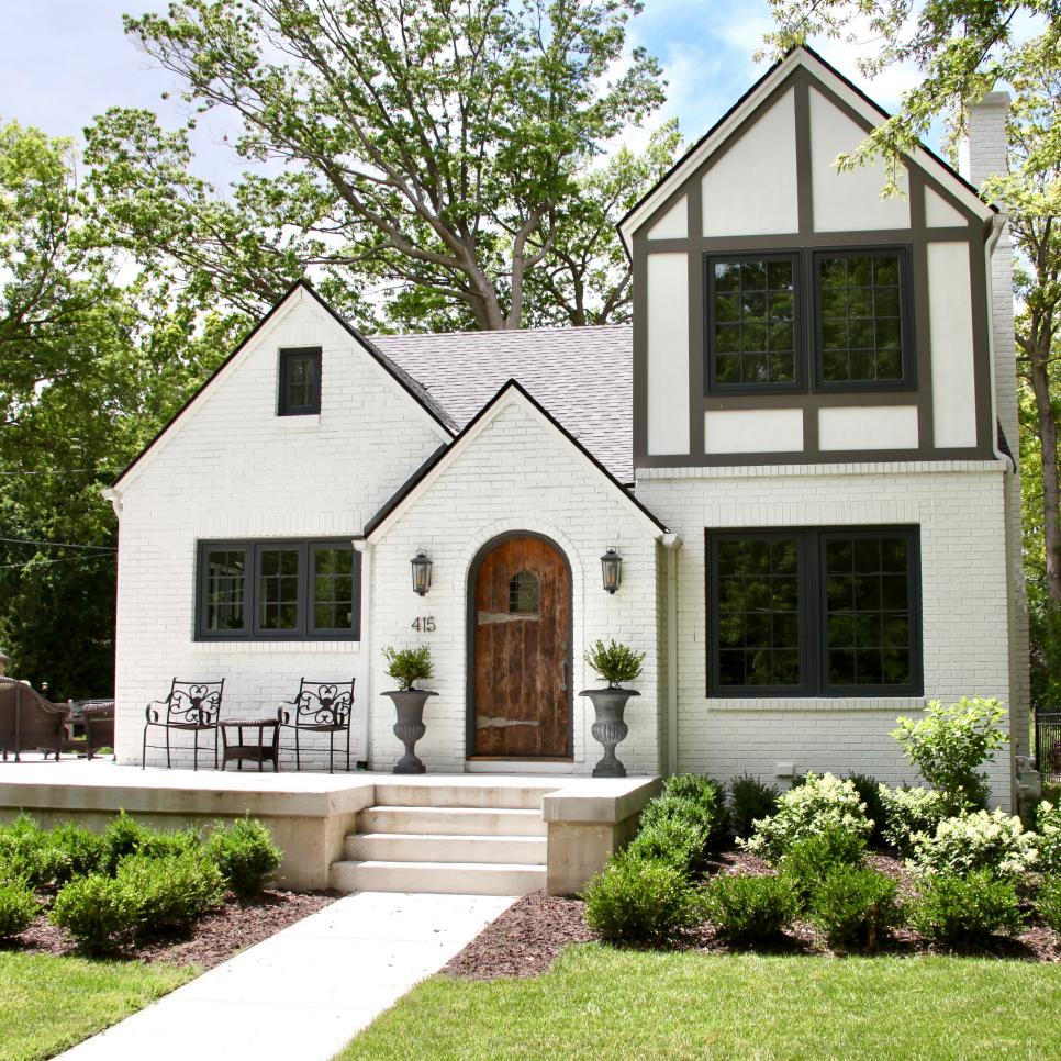
After: A Vision in White
Designer Jean Stoffer polished the diamond-in-the-rough by adding on additional living space upstairs and giving the home’s brick exterior a bright white coat of paint contrasted with charcoal gray trim. Low, foundation plantings and a pair of boxwoods in zinc planters softly tie the home into the natural surroundings. See more of this home’s dramatic transformation.
Before: Dull and Dreary
Before renovations, this home lacked any curb appeal or charm. NMA Architects completed a total transformation, with a new home exterior and landscaping.
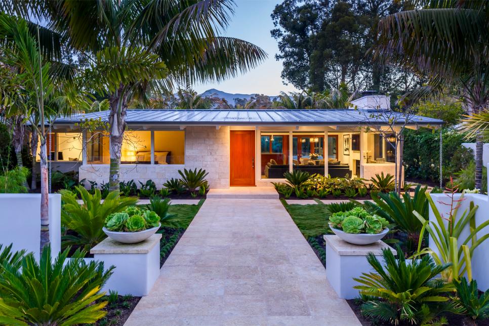
After: Vibrant Tropical Beach Villa
This ranch style home was updated to feature a neutral stone exterior and a dark gray metal roof with rain chains instead of gutters. Like the exterior, the walkway is designed from a neutral stone, leading the way to the mahogany front door. Palm trees and other tropical plants are used for landscaping throughout the front yard.
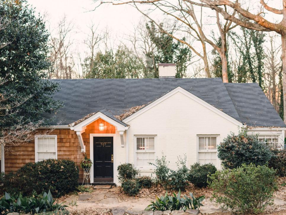
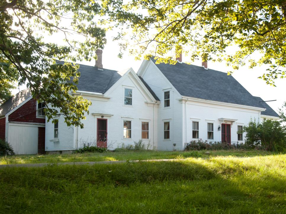
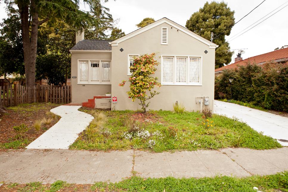
Before: Charming Cottage Lacking Upkeep
Prior to renovations, the exterior of this cottage lacked proper upkeep and yard maintenance.
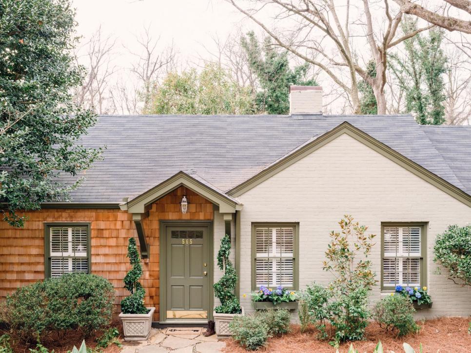
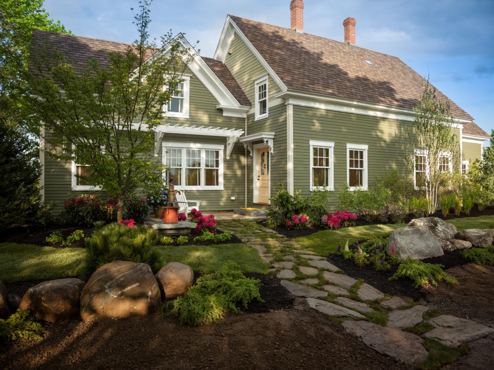
After: Lovely Home With Historic Color Palette
This home gets a fresh update by looking to the past, with a palette of colors from a historic preservation guide. Cedar shingles add color and architectural interest.
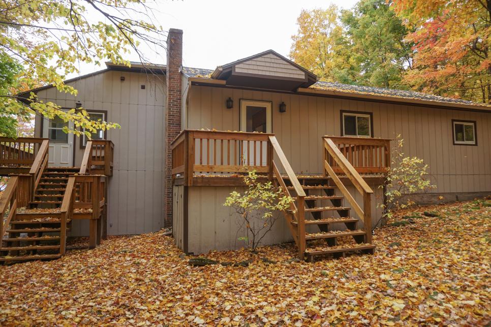
Before: Drab and Dismal Exterior
Without much landscaping or exterior charm, DIY Network’s Ultimate Retreat 2017 before renovations, is quite an eyesore.
After: Fabulous Front Yard
The DIY Network Ultimate Retreat 2017 was updated with lovely landscaping and a well-detailed exterior with contrasting light and dark colors.
Before: Deserted Home Lacks Appeal
Run down and abandoned looking, DIY Network’s Blog Cabin 2012 lacks any captivating qualities, prior to renovations.
After: Charming Cabin
DIY Network’s Blog Cabin 2012 was totally updated. From the exterior paint color to the landscaping, this home got the complete exterior makeover it deserved.
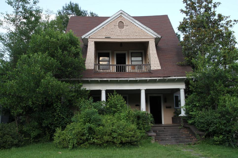
Before: Abandoned Abode
Once the home of a prominent local family, this century-old charmer (built in 1900) had been unoccupied for so long that a large colony of honey bees had take up residence within the home’s exterior walls. (Don’t worry, no bees were harmed in the restoration of this home.)
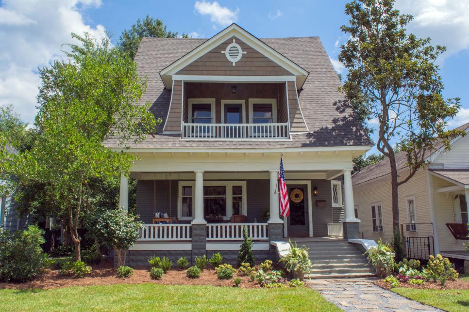
After: Remarkably Restored
A far cry from its formerly shabby shape, this freshly renovated home is a crowning jewel of the neighborhood and was recently listed on the National Register of Historic Places. Among the improvements are fresh cedar shakes, new porch railing and a flagstone and pea-gravel pathway. Husband and wife team Erin and Ben Napier completed the transformation; Ben even used reclaimed lumber from the home’s interior to create a swinging daybed for the front porch. Learn more about this makeover from HGTV’s Home Town.
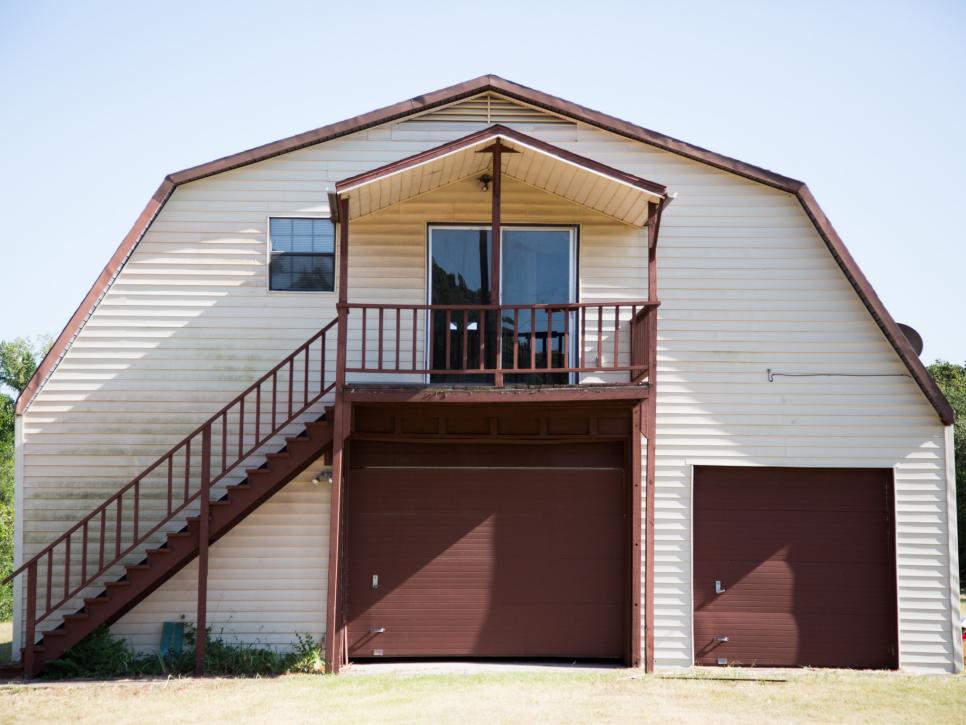
Before: Yep, That’s a Barn
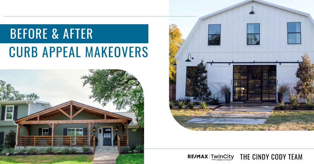
Originally constructed in 1980 as a stable complete with horse stalls and hay storage, the barn underwent a previous remodel to add a modest apartment above but with its drab color, lack of windows and structural reminders of the barn’s prior use — stalls and all — turning this big structure into a livable home would be no small undertaking.
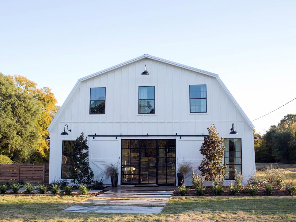
After: The Famous ‘Barndominium’
Chip and Jo worked their magic to turn this structure that, truly, was never intended as a house into a residence any farmhouse fan would be proud to call home. Improvements include removing the stairs and upper entrance, installing larger windows for a light-filled interior and swapping out the metal garage door for an impressive bank of paned glass doors. See more of this favorite Fixer Upper transformation.
Before: Blank Slate
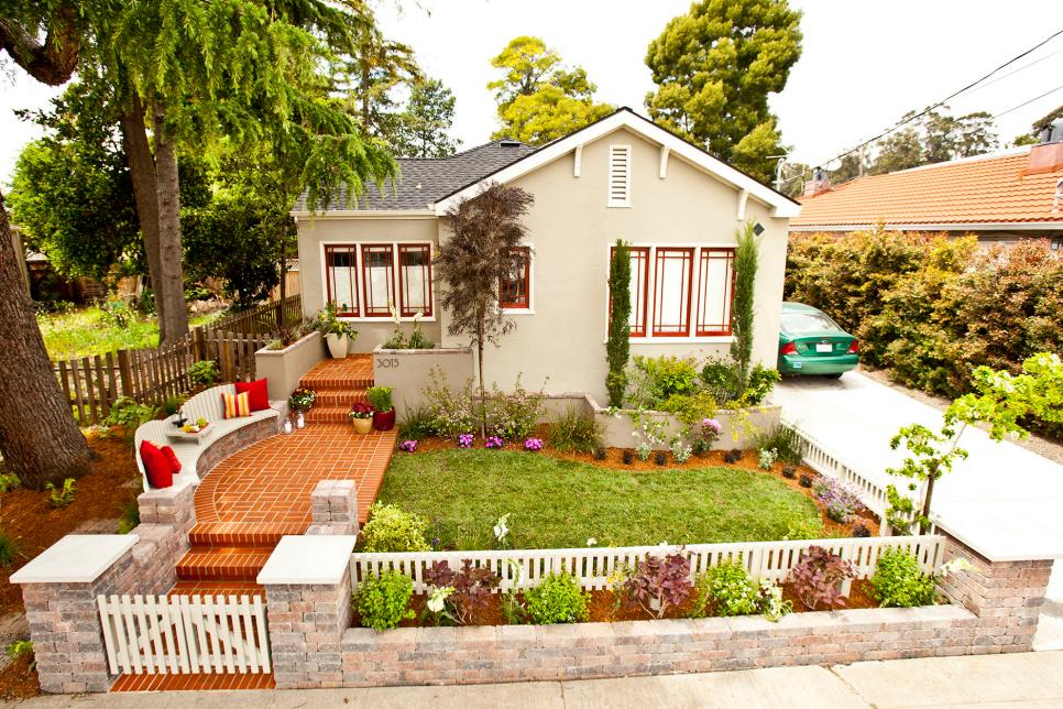
The homeowners bought this home two years ago but with three young boys — two with special needs — all of their energy and finances go toward the kids, leaving nothing for fixing up the front yard.After: Craftsman Cutie
The homeowners want to be able to relax in the front yard while keeping an eye on their young boys and chatting with neighbors. Designer John Gidding delivered by expanding their too-small front porch and adding new steps that lead down to a wide walkway flanked by a long curving bench. A low gated wall separates the front yard from the sidewalk and really makes the front yard feel more like an outdoor room.
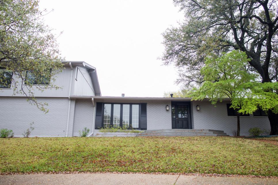
Before: An Architectural Mismatch
Dubbed “the cargo ship house” by Fixer Upper’s Chip Gaines, this long, gray and bland exterior was certainly short on charm. The ranch-style brick portion was originally built in 1958 with the wood-clad second story tacked on as a later addition.After: An Artful Addition
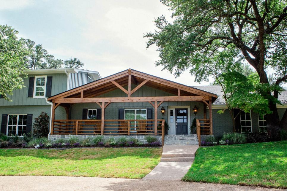
Wow, what a transformation! Chip and Joanna dramatically took this home from sad to stately with a porch bump-out that features post-and-beam construction, horizontal railing and a flagstone porch and stairs. Woodsy green paint, new windows and black shutters further boost the home’s curb appeal. See more photos of this home’s dramatic makeover.
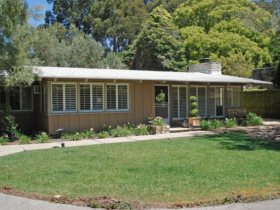
Before: ’60s Modernist
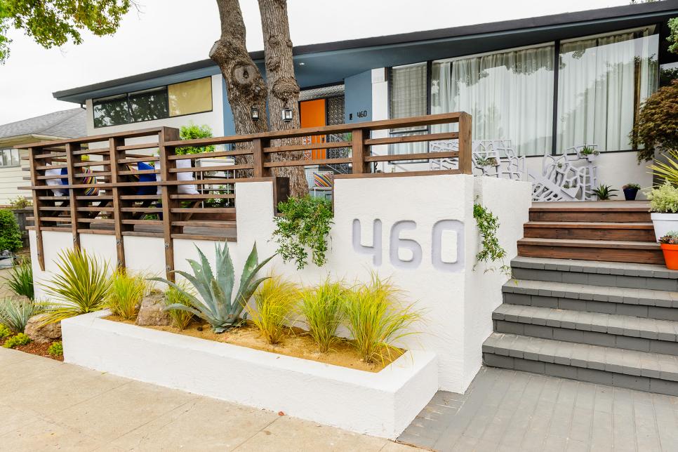
The current owners were drawn to the home’s Modern aesthetic and streamlined details but the ho-hum landscaping is definitely lacking. Three generations of one family live here and want to be able to use the hilly, uneven front yard as more of a gathering and entertaining space.After: A Nod to Midcentury Mod
Designer John Gidding decided to save the existing mature trees, building a massive deck to surround them. The uneven front yard is eliminated by a concrete retaining wall that brings the deck up to front door height. Concrete planters at street level are filled with boulders, agave and desert grasses while rosemary tumbles over the wall from the deck.


